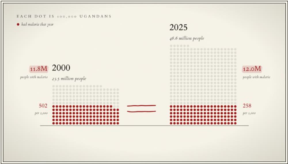
An interactive data story: 26 years of malaria data for every district in Uganda, and who is paying to keep the gains.
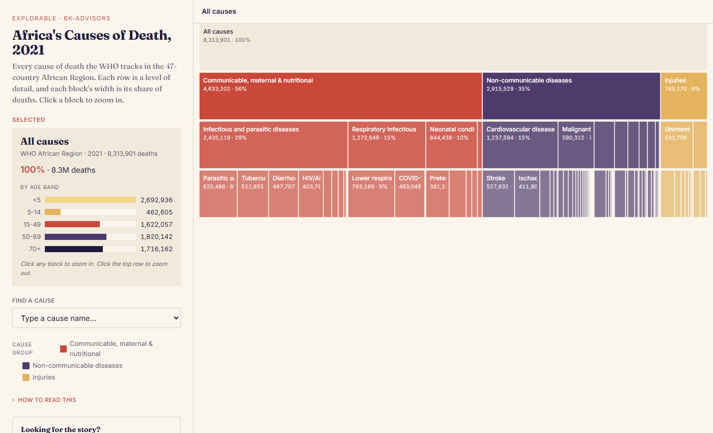
An explorable data story on the causes of death in Africa, from the WHO Global Health Estimates 2021.
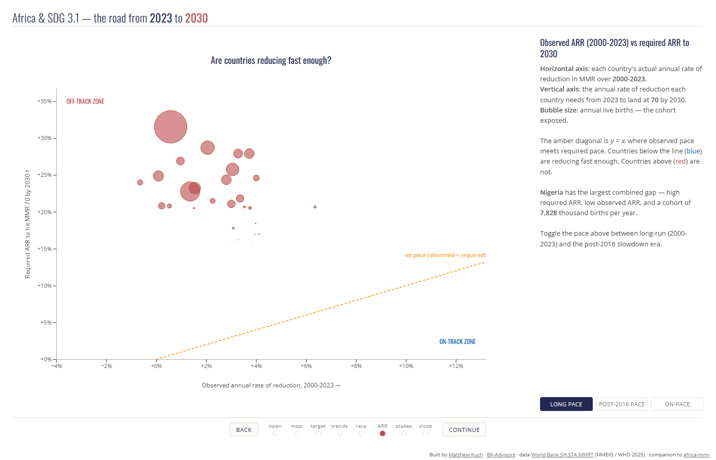
Of Africa’s 54 countries, 10 are on pace to meet SDG 3.1 by 2030. An interactive look at the road from 2023 to 2030.
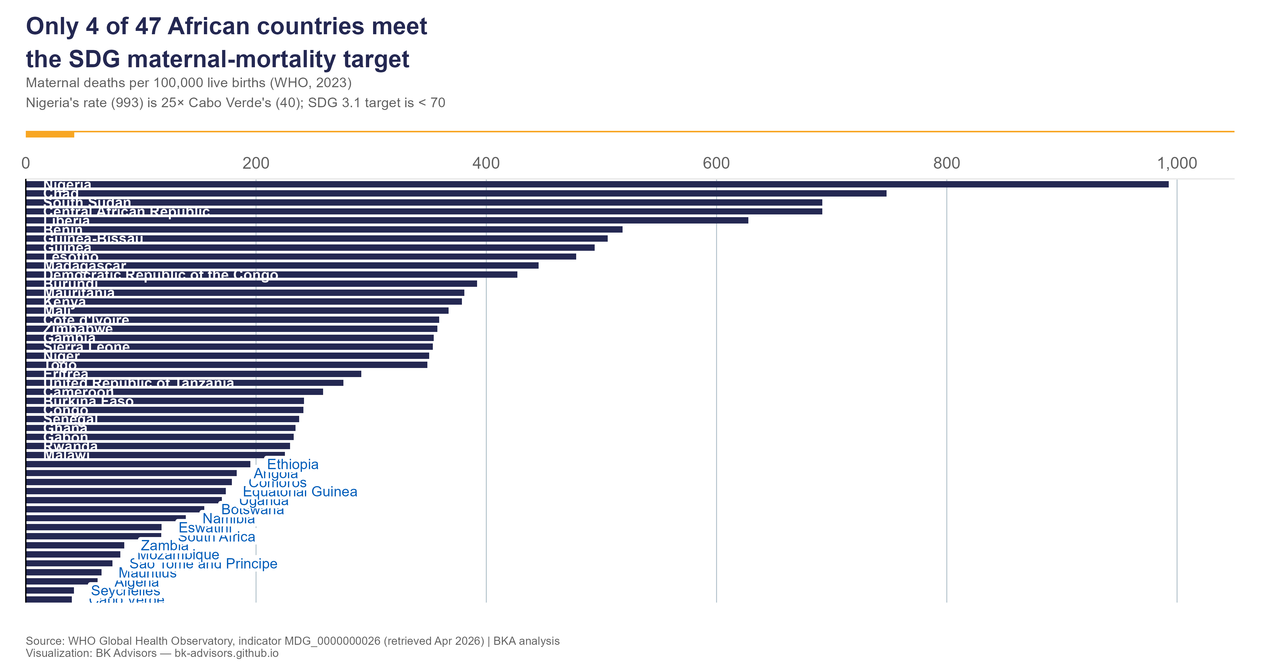
In 2023, a woman giving birth in Nigeria was 25 times more likely to die than one giving birth in Cabo Verde. An interactive chart of maternal mortality across Africa.
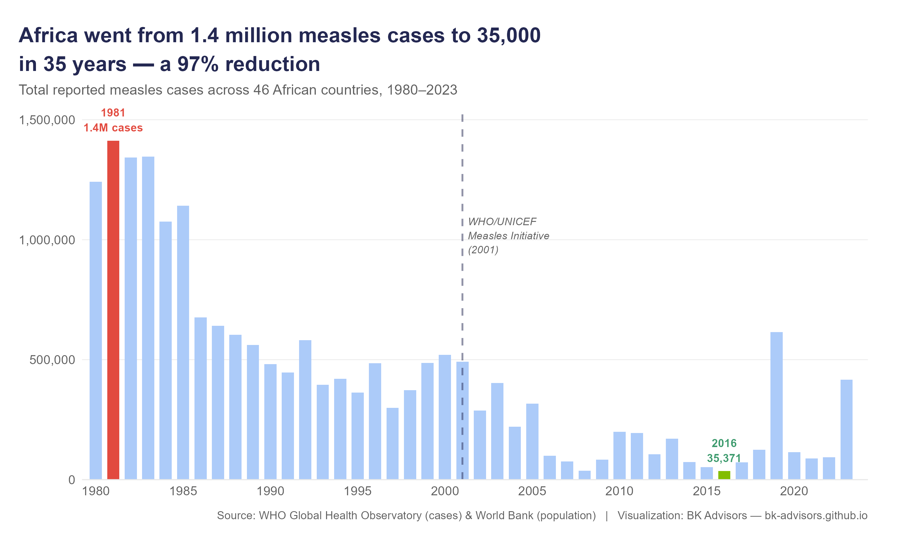
In 1981, measles infected 1.4 million people across Africa in a single year. By 2016, it was 35,000. An interactive heatmap of 44 years and 46 countries.
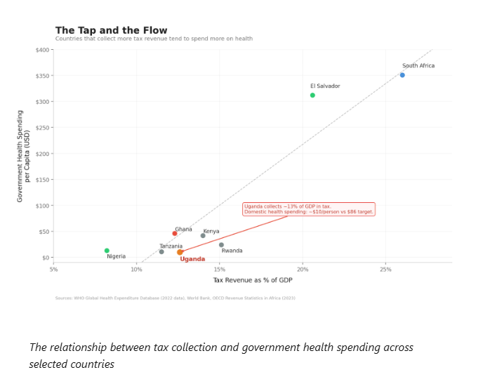
Of all the drivers of health spending — aid, debt, corruption, elections — the one that matters most is tax revenue. Uganda’s anemic tap.
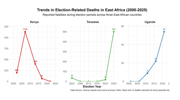
Elections aren’t just political events; they quietly decide who lives long enough to see their leaders govern. The public-health cost of unrest.
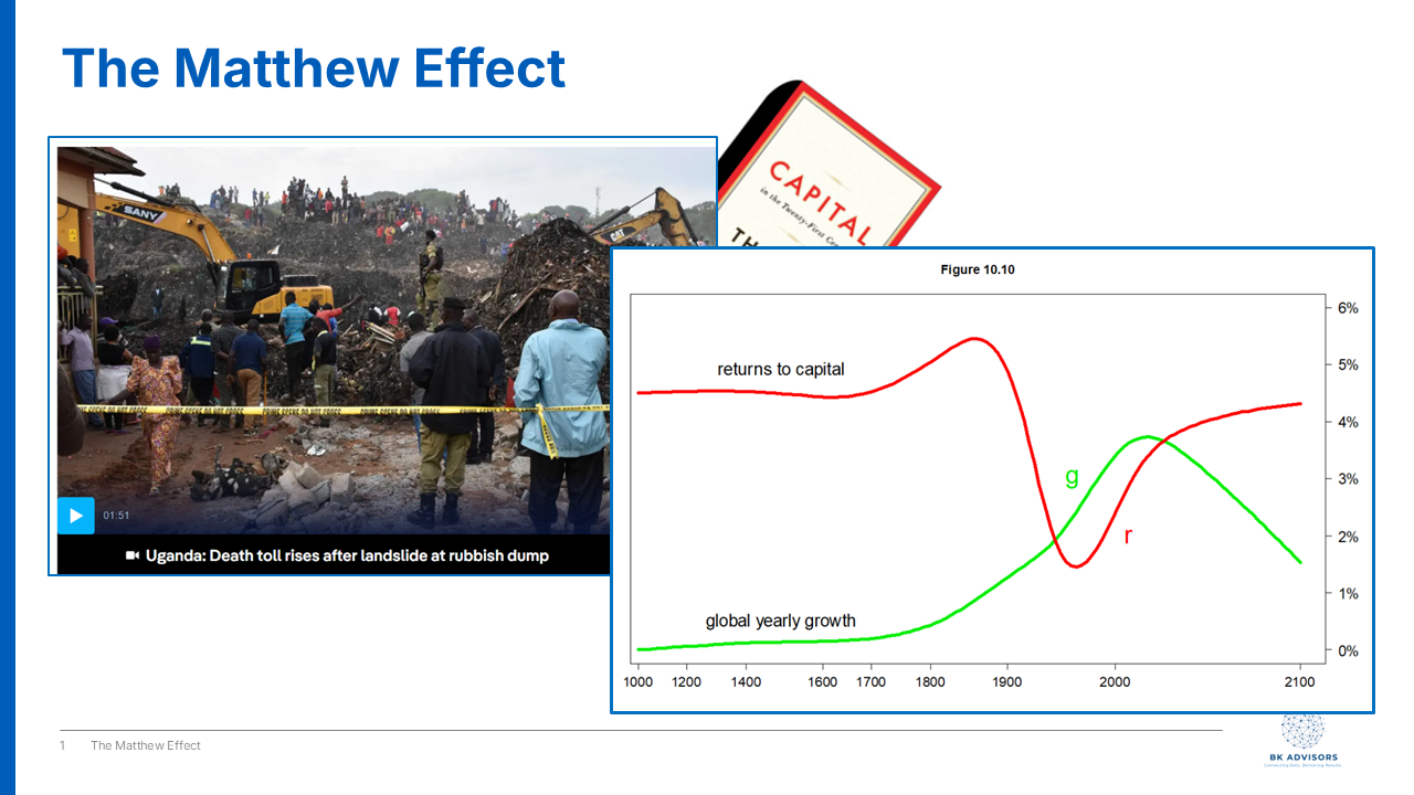
How R > g — the Matthew Effect — compounds advantage for a few and erases it for the most vulnerable, and why that makes the social sector essential.
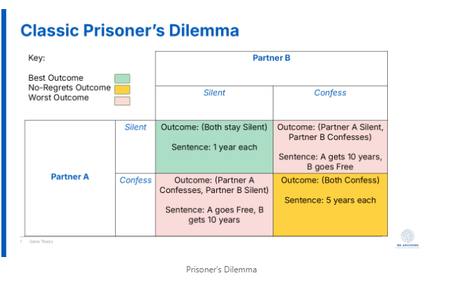
A game-theory look at why the political system rewards corruption and punishes honesty — and what it would take to change the rules.
This post explores the displacement effect and how it shapes government investment decision making
A personal story about what a USD 130 hospital bill reveals about Uganda’s health financing.
A short story about securing the national interest.