Projects
These are the pieces where the argument needed more than prose. Each one is a standalone interactive story, built in R, D3 or Svelte and hosted separately.
Malaria in Uganda
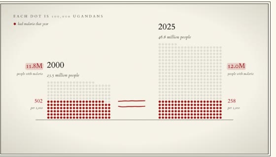
Uganda nearly halved its malaria rate between 2000 and 2025, yet about as many people fell sick in 2025 as in 2000, because the population doubled. This story walks through 26 years of data, district by district, and asks who will keep paying to hold the gains. You can look up your own district.
The Case for HPV Vaccination in Papua New Guinea
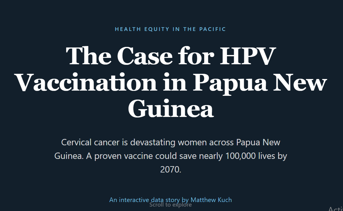
A scrollytelling data story making the investment case for HPV vaccination in PNG, built from a cervical-cancer prevention project I worked on. Cervical cancer is the country’s leading cause of cancer death among women, and almost entirely preventable.
Measles in Africa
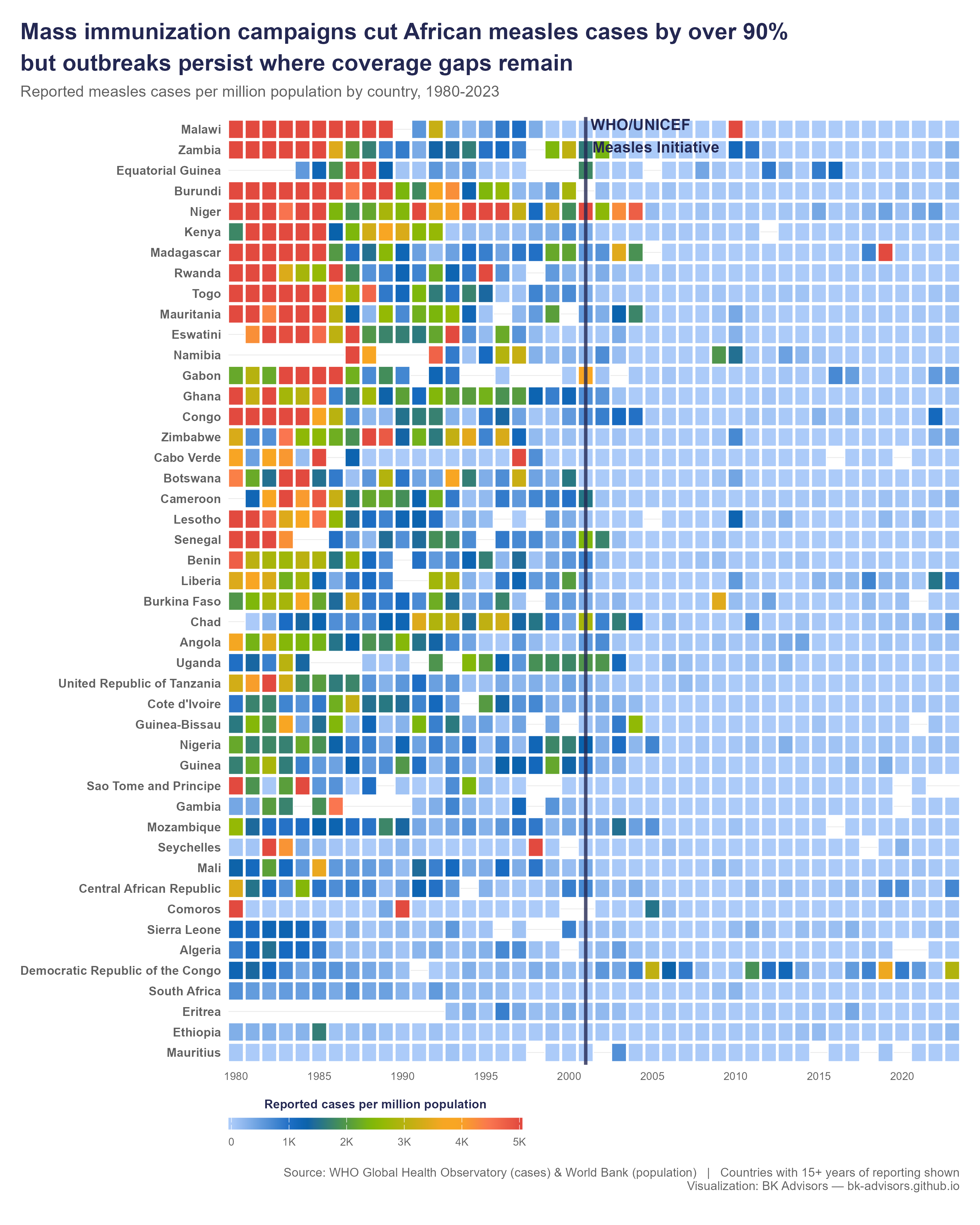
In 1981 measles infected 1.4 million people across Africa in a single year. By 2016 it was 35,000, a 97% fall. This heatmap lets you watch the red tiles fade to blue, country by country and year by year. It makes one of the great public health achievements visible again.
Maternal Mortality in Africa
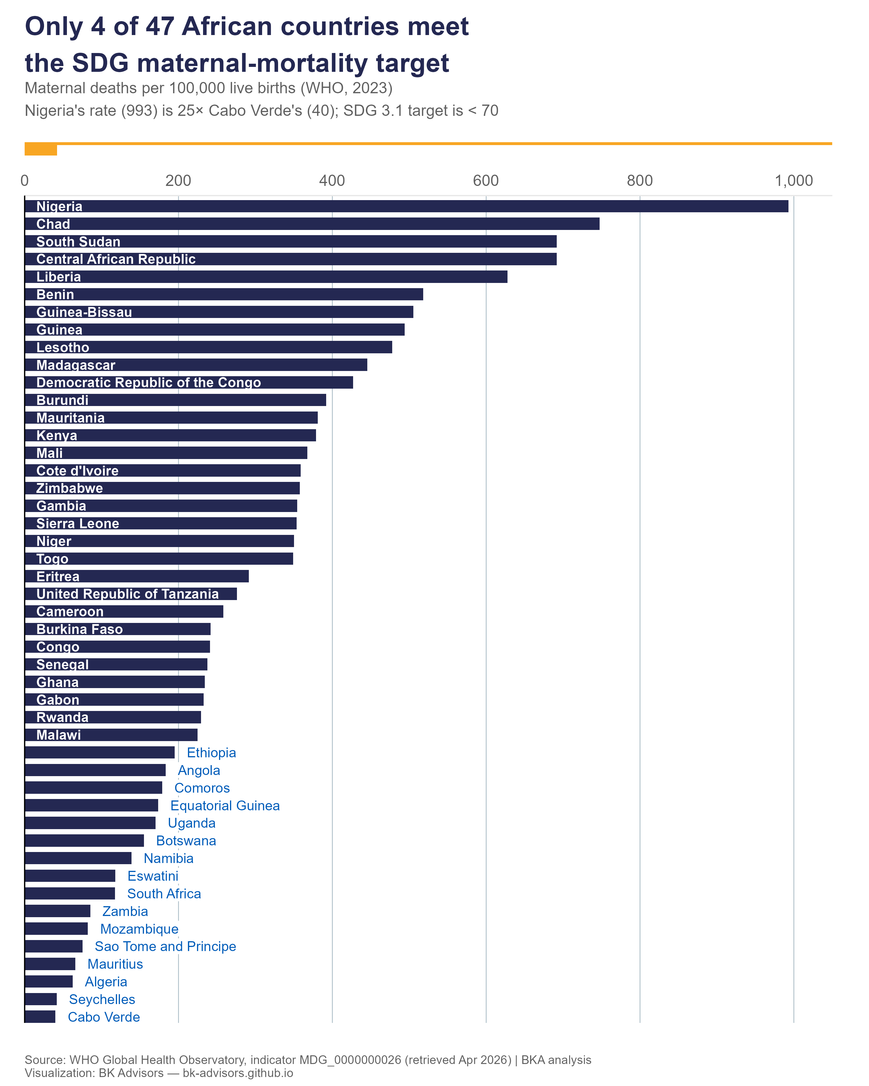
In 2023 a woman giving birth in Nigeria was 25 times more likely to die than one giving birth in Cabo Verde. Only 4 of 47 African countries meet the SDG 3.1 target. This chart makes the gap impossible to look away from.
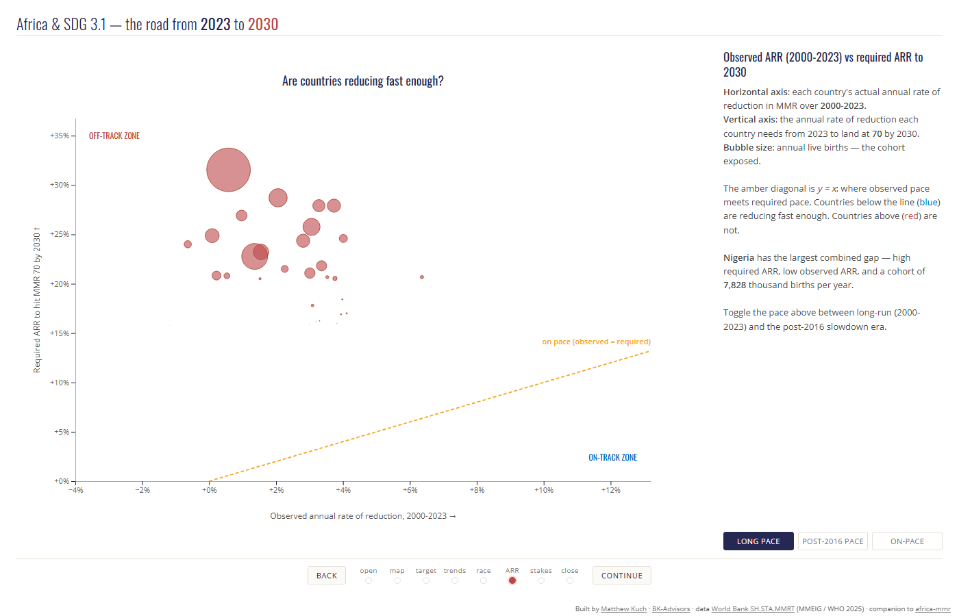
Africa and SDG 3.1: The Road to 2030
The follow-up to the chart above. Of Africa’s 54 countries, 10 are on pace to bring maternal deaths below 70 per 100,000 live births by 2030. At current rates, roughly 530,000 more mothers will die by 2030 than if every country were on pace. Watch every country race towards the deadline.
The Lost Decade
What a 2023 Lancet paper on preterm births tells us about a decade of stalled progress on newborn survival, and why preterm birth has become the single largest driver of under-five deaths.
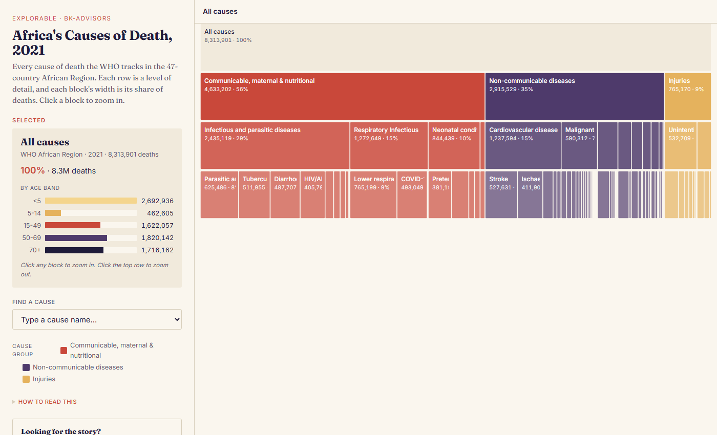
Causes of Death in Africa
What 8.3 million deaths across the WHO African Region in 2021 looked like, by cause and by age band. We organise health attention around outbreaks like Ebola, while the steady, predictable causes do most of the killing. Read the story, or poke at every cause the WHO tracks in the explorable version.